cd ../blog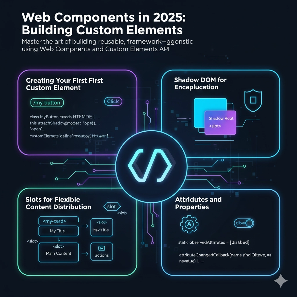
1.**Always extend HTMLElement** - Never create custom elements from scratch 2.**Use Shadow DOM** - For proper encapsulation 3.**Implement observedAttributes** - For reactive properties 4.**Emit custom events** - For component communication 5.**Document your API** - Make slots and attributes clear
11 min read Web APIs
Web Components in 2025: Building Custom Elements
Master the art of building reusable, framework-agnostic components using Web Components and Custom Elements API.
Web Components Custom Elements Frontend
## The Web Components Revolution
Web Components offer true reusability without framework overhead. They're the foundation of modern web standards.
## Creating Your First Custom Element
Define custom elements using the Custom Elements API:
javascript
class MyButton extends HTMLElement {
  constructor() {
    super()
    this.attachShadow({ mode: 'open' })
  }

  connectedCallback() {
    this.render()
    this.addEventListener('click', () => this.handleClick())
  }

  handleClick() {
    this.dispatchEvent(new CustomEvent('button-clicked', {
      detail: { message: 'Button was clicked' },
      bubbles: true
    }))
  }

  render() {
    this.shadowRoot.innerHTML = `
      <style>
        button {
          padding: 10px 20px;
          background: #007bff;
          color: white;
          border: none;
          border-radius: 4px;
          cursor: pointer;
        }
        button:hover {
          background: #0056b3;
        }
      </style>
      <button><slot>Click me</slot></button>
    `
  }
}

customElements.define('my-button', MyButton)
## Shadow DOM for Encapsulation
The Shadow DOM provides style and structure encapsulation:
javascript
class MyCard extends HTMLElement {
  constructor() {
    super()
    this.attachShadow({ mode: 'open' })
  }

  connectedCallback() {
    this.shadowRoot.innerHTML = `
      <style>
        :host {
          display: block;
          border: 1px solid #ddd;
          border-radius: 8px;
          padding: 16px;
        }

        .header {
          font-weight: bold;
          margin-bottom: 8px;
        }
      </style>
      <div class="header"><slot name="title"></slot></div>
      <div class="content"><slot></slot></div>
    `
  }
}

customElements.define('my-card', MyCard)
## Slots for Flexible Content Distribution
Slots allow flexible content composition:
html
<my-card>
  <span slot="title">My Title</span>
  <p>This is the main content</p>
  <button slot="actions">Action Button</button>
</my-card>
## Attributes and Properties
Properly implement reactive attributes:
javascript
class MyComponent extends HTMLElement {
  static observedAttributes = ['disabled', 'label']

  attributeChangedCallback(name, oldValue, newValue) {
    if (name === 'disabled') {
      this.updateDisabledState(newValue !== null)
    }
    if (name === 'label') {
      this.updateLabel(newValue)
    }
  }

  updateDisabledState(isDisabled) {
    const button = this.shadowRoot.querySelector('button')
    if (button) {
      button.disabled = isDisabled
    }
  }

  updateLabel(newLabel) {
    const label = this.shadowRoot.querySelector('.label')
    if (label) {
      label.textContent = newLabel
    }
  }
}
## Real-World Example: Reusable Modal Component
javascript
class ModalDialog extends HTMLElement {
  constructor() {
    super()
    this.attachShadow({ mode: 'open' })
  }

  connectedCallback() {
    this.render()
    this.setupEventListeners()
  }

  setupEventListeners() {
    const closeBtn = this.shadowRoot.querySelector('.close')
    const backdrop = this.shadowRoot.querySelector('.backdrop')

    closeBtn?.addEventListener('click', () => this.close())
    backdrop?.addEventListener('click', () => this.close())
  }

  open() {
    this.setAttribute('open', '')
  }

  close() {
    this.removeAttribute('open')
    this.dispatchEvent(new CustomEvent('modal-closed'))
  }

  render() {
    this.shadowRoot.innerHTML = `
      <style>
        :host {
          --z-index: 1000;
        }

        :host([open]) .backdrop {
          display: flex;
        }

        .backdrop {
          display: none;
          position: fixed;
          top: 0;
          left: 0;
          right: 0;
          bottom: 0;
          background: rgba(0, 0, 0, 0.5);
          align-items: center;
          justify-content: center;
          z-index: var(--z-index);
        }

        .dialog {
          background: white;
          padding: 24px;
          border-radius: 8px;
          max-width: 500px;
          position: relative;
        }

        .close {
          position: absolute;
          top: 8px;
          right: 8px;
          background: none;
          border: none;
          font-size: 24px;
          cursor: pointer;
        }
      </style>

      <div class="backdrop">
        <div class="dialog">
          <button class="close">×</button>
          <slot></slot>
        </div>
      </div>
    `
  }
}

customElements.define('modal-dialog', ModalDialog)
## Framework Integration
Web Components work seamlessly with any framework:
jsx
// React
<MyButton onClick={handleClick}>Click me</MyButton>

// Vue
<my-button @button-clicked="handleClick">Click me</my-button>

// Angular
<my-button (button-clicked)="handleClick($event)">Click me</my-button>
## Best Practices
## Conclusion
Web Components are the future of reusable web elements. Master them to build truly portable, framework-agnostic components.
// Thanks for reading!