cd ../blog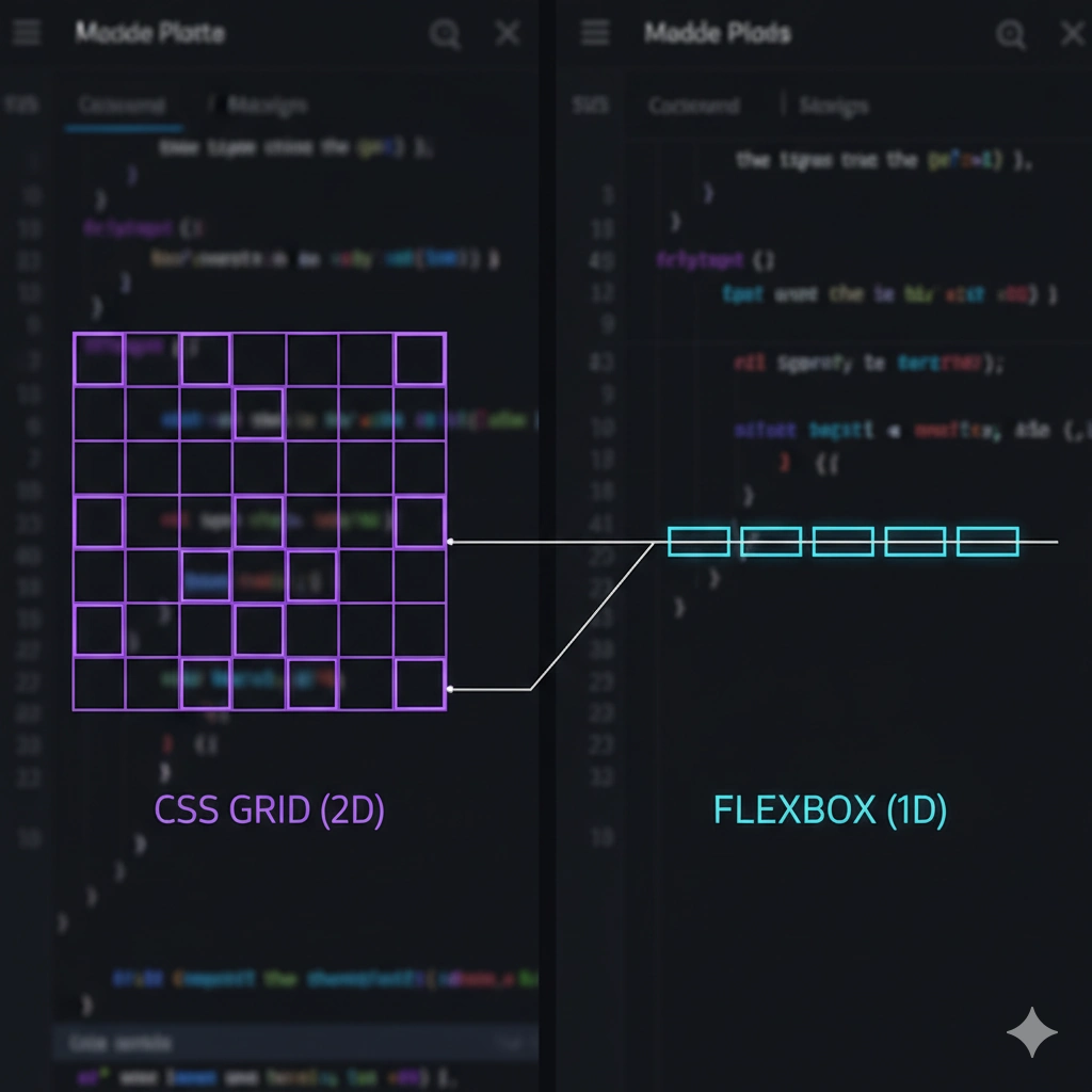
5 min read CSS
Flexbox vs Grid: When to Use Each with Code Examples
Stop guessing which property to use. I explain the technical differences and give you clear examples to master your application layouts.
Layout Flexbox Grid
## The Dimensional Approach
The technical difference is simple: **Flexbox** is one-dimensional (row OR column) and **Grid** is two-dimensional (row AND column at the same time).
## When to Use Each?
Use **Grid** for the page skeleton. For example, a product grid:
css
.product-container {
  display: grid;
  grid-template-columns: repeat(auto-fit, minmax(250px, 1fr));
  gap: 20px;
}
Use **Flexbox** for aligning internal elements, such as a navigation bar:
css
.navbar {
  display: flex;
  justify-content: space-between;
  align-items: center;
}
## The Winning Combination
You don't have to choose one. The most professional approach is using Grid for the macro structure (header, main, sidebar, footer) and Flexbox for micro components inside those cells. This combination gives you total control without cluttering the code.
// Thanks for reading!